HTML Color Input: How to Use and Style <input type="color">
November 23, 2023 | 5 minutesIn This Post
If you're like me, you've probably needed a color picker and reached for a component within your framework of choice (React, Vue, etc.). This can be a great choice in that it generally gives you more control over the look of the color picker across browsers.
You don't need to use a component, though. There's actually a color input type for the HTML input element.
<input type="color" />
I recently came across this input type and wanted to use it for a simple project, but noticed that the color input actually looks different across browsers and isn't round like I wanted. You can change the look of the color picker (somewhat), though, with CSS.
Sample Code
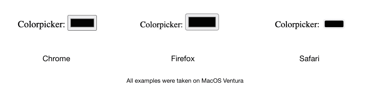
Here's a Codepen with styles to make the color input round. The color input below should appear the same in Chrome, Firefox, and Safari.
Exploring Default Browser Styles for HTML Elements
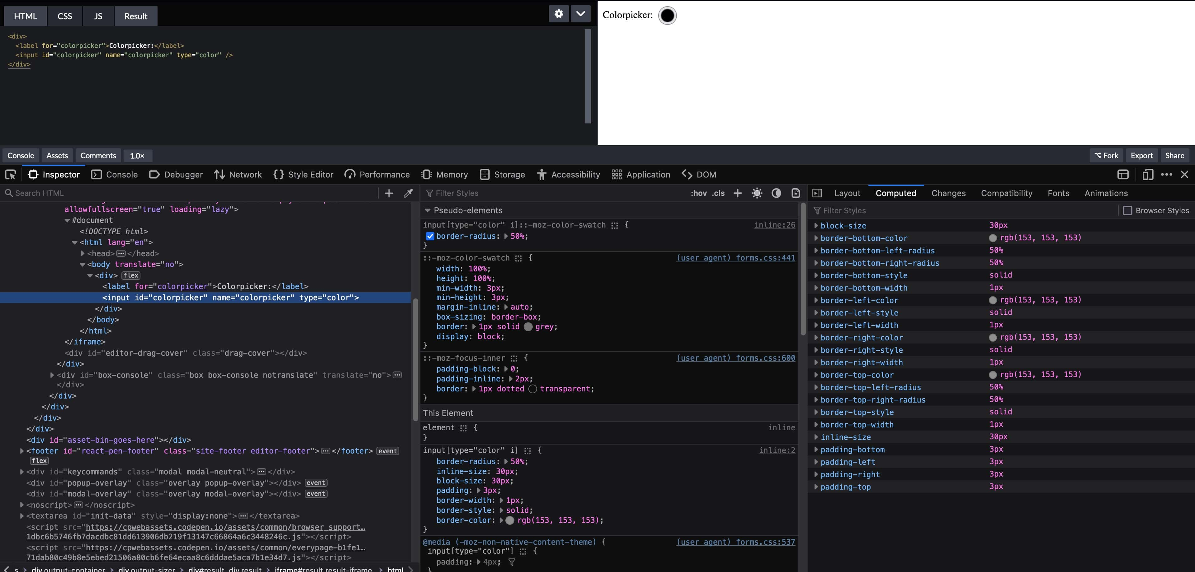
Chrome: Enable Shadow DOM in Chrome Dev Tools
Since the color input is a native HTML element, its internal DOM structure is part of a shadow DOM. To see the internal structure and see what properties are available to target with CSS, you can do the following to enable the shadow DOM in the Chrome Dev Tools:
- Click on the Settings icon, which is the gear icon toward the top right corner of the Dev Tools
- On the Settings panel, go to the Elements section and check the box next to the "Show user agent shadow DOM" option
- Close the settings panel
Now, when you select the color input in the Elements panel within Dev Tools, it should have a triangle to the left of it. Click on the triangle and it'll open the shadow DOM.
Firefox: Inspect Pseudo Elements in Firefox Dev Tools
Firefox doesn't allow you to inspect the shadow DOM for elements in the Dev Tools (at least, not that I could find). You can see the pseudo elements associated with a DOM element, though, which is helpful for our use case. Just select the color input in the Inspector panel in the Dev Tools and in the first panel to the right, the pseudo-elements associated with it will appear at the top of the panel.
Styling the Color Input
Styling the "Outer Border" of the Input (aka, the input itself)
You can style the outer border around the color input in all browsers using the input[type="color" i] selector. The following CSS, for example, will make the color input round and set consistent border styles across browsers.
1input[type="color" i] { 2 border-radius: 50%; 3 inline-size: 30px; 4 block-size: 30px; 5 border-width: 1px; 6 border-style: solid; 7 border-color: rgb(153, 153, 153); 8}
Setting the border-radius property isn't enough in this case to make the outer border of the color input round. The user agent (default) styles applied by the browser set the inline-size and block-size logical properties to determine the width and height of the input, so those also need to be overridden with a consistent size.
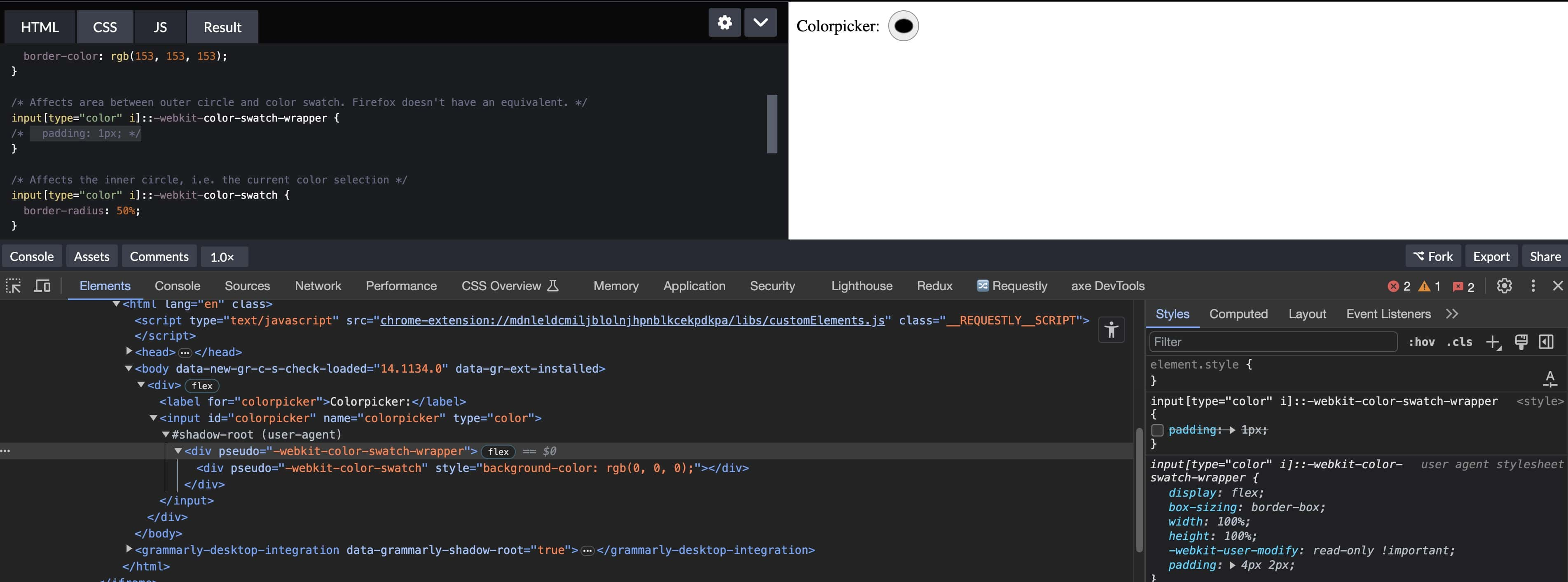
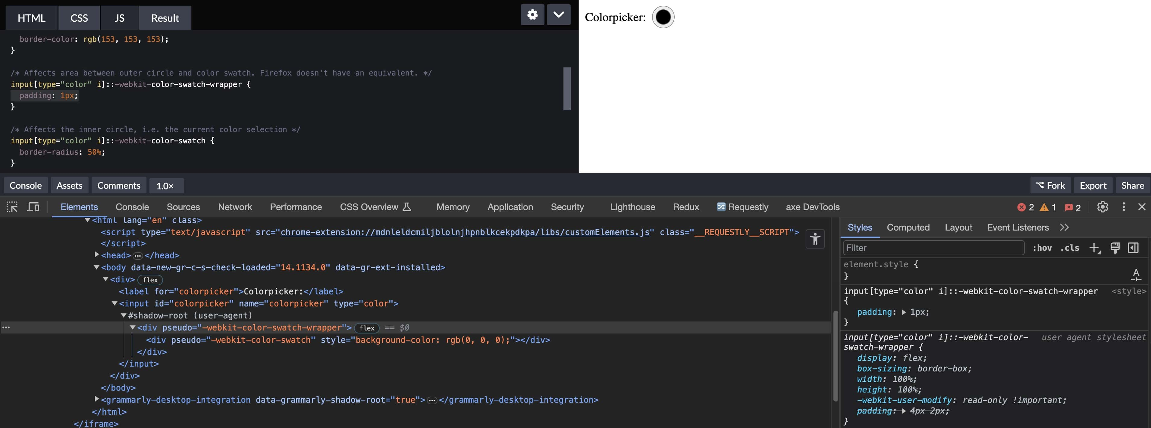
Chrome: Styling the Color Swatch Wrapper
The ::-webkit-color-swatch-wrapper pseudoclass can be used to change the area between the outer circle and the color swatch. The following CSS will adjust the padding between the outer circle and the color swatch.
1input[type="color" i]::-webkit-color-swatch-wrapper {
2 padding: 1px;
3}
Firefox doesn't have an equivalent pseudoclass, though. You can set the padding in a cross-browser compatible way by setting the padding value on the input[type="color" i] selector directly.
1input[type="color" i] {
2 padding: 1px;
3}
In Chrome, to get a perfectly round color swatch if you do set the padding on the input[type="color" i] selector, you'll also need to set padding on the input[type="color" i]::-webkit-color-swatch-wrapper. Otherwise, the padding will be inconsistent around the color swatch. Chrome automatically sets padding: 4px 2px (as of the time of writing) on the pseudoclass, so if you just set the padding on the input, the color swatch looks smooshed.
Chrome and Firefox: Styling the Color Swatch
Both Chrome and Firefox have color-swatch pseudoclasses that change the appearance of the color swatch itself. The following CSS will set the border radius so that the swatch is a circle instead of a square.
1input[type="color" i]::-webkit-color-swatch, 2input[type="color" i]::-moz-color-swatch { 3 border-radius: 50%; 4}
If you're interested in other ways to customize how native browser UI adapts to your design, check out how to use the CSS color-scheme property to support dark mode or how to style smooth page transitions with the View Transition API.
Frequently Asked Questions
How do I make the HTML color input round?
Set border-radius: 50% along with equal inline-size and block-size values on input[type="color" i]. You also need to style the color swatch with ::-webkit-color-swatch and ::-moz-color-swatch pseudo-elements to make the inner swatch round too.
Why does the color input look different in Chrome and Firefox?
Each browser applies its own user-agent styles to native form elements. Chrome and Firefox use different pseudo-elements for the color swatch. Use ::-webkit-color-swatch for Chrome/Safari and ::-moz-color-swatch for Firefox.
How do I remove the border around the color input swatch?
Target both ::-webkit-color-swatch and ::-moz-color-swatch pseudo-elements and set border: none on them. This removes the default border that browsers add around the color swatch.
Thumbnail image credit: Markus Spiske