Anchoring Hover Menus to Scrollable Elements
December 28, 2023 | 12 minutesIn This Post
It's common to build user interfaces that contain a list of items where each item can have a set of actions applied to it. For example, maybe you're rendering a list of content items in a CMS and need to allow users to edit the items. Displaying lists of items with repetitive links can become visually overwhelming and distracting, especially if there are many rows on the screen at a time.
One solution for this problem is to present a menu with relevant links when hovering over a row. The positioning can be a little tricky, though, if the row is within a scrollable element. This blog post will walk through one approach to solving the problem with React, JavaScript methods, and some basic math by building the example below.
Thinking about Element Positioning
To anchor a menu to a scrollable list item on hover, we first need to determine which element the hover menu should be anchored to. In our example, we'll be creating a structure that follows the diagram below.
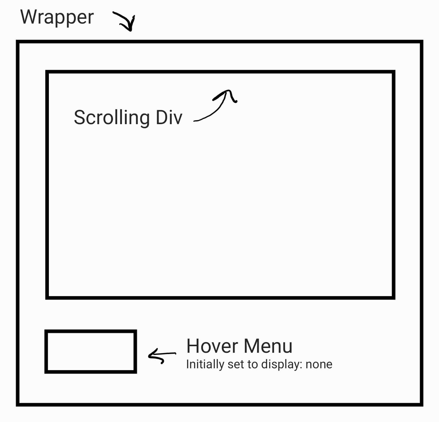
Note: Spaces between elements are for diagram clarity, but don't actually exist in the HTML.
At the outermost layer, we'll have a div element with the class wrapper that has position: relative. Within this div, we'll have two other div elements:
- A
divwith the classscrollingDivthat hasoverflow-y: scrollalong with a fixed height. Thisdivwill render a list of items. - A
divwith the classhoverMenuthat hasposition: absolute. This will be used as our hover menu.
Each list item (aka, row) will move up and down within the scrollingDiv element as you scroll. The rows are the elements that we want to anchor the hover menu to, meaning that when you hover over a row, the hover menu should appear over that row.
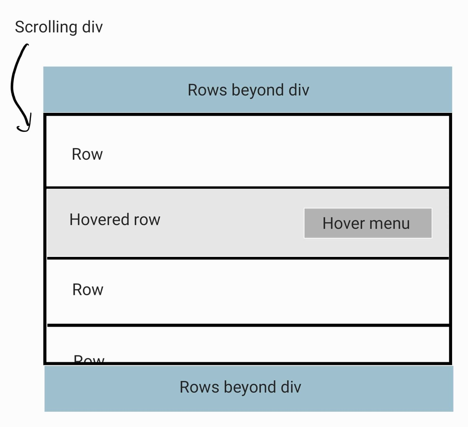
Which element should we position the menu relative to, so that it appears over the correct row?
To position the hover menu over the row that's being hovered, we need to position it relative to the parent wrapper element. By using the closest parent element with position: relative that contains both the scrollingDiv element and the hover menu, we can ensure that the menu position is contained within the dimensions of the scrollableDiv (assuming the wrapper element is the same size, as it is in our example). Otherwise, the menu would be positioned relative to the window, which would cause undesired positioning behavior. The difference between the row and the wrapper element will give us the distance to position the hover menu from the top and left of the wrapper element.
Building a Scrolling Div with a Hover Menu
To start, let's build the general structure for our scrolling div with a hover menu component.
1import React from "react";
2
3// Sample data to render in the scrolling div
4const data = [{
5 id: 1,
6 title: "Manicotti",
7}, {
8 id: 2,
9 title: "Spaghetti",
10}, {
11 id: 3,
12 title: "Lasagna",
13}, {
14 id: 4,
15 title: "Pizza",
16}, {
17 id: 5,
18 title: "Lemon Chicken"
19}];
20
21export const ScrollingDivWithHoverMenu = ({ data }) => {
22 return (
23 <div className="wrapper">
24 <div className="scrollingDiv">
25 <ul>
26 {data.map((item) => {
27 return (
28 <li className="item" key={item.id}>
29 {item.title}
30 </li>
31 );
32 })}
33 </ul>
34 </div>
35
36 <div className="hoverMenu">
37 <button onClick={() => alert('Adding a description')}>✏️ Add a Description</button>
38 </div>
39 </div>
40 )
41}
The component also needs some styles to render properly.
1.wrapper {
2 position: relative;
3 width: 500px;
4}
5
6.scrollingDiv {
7 width: 100%;
8 height: 200px;
9 overflow-y: scroll;
10 border: 1px solid #000000;
11 display: flex;
12 flex-direction: column;
13}
14
15.scrollingDiv ul {
16 list-style: none;
17 padding: 0;
18 margin: 0;
19}
20
21.scrollingDiv .item {
22 border-bottom: 1px dotted #000000;
23 padding: 1rem 1rem 1.5rem;
24 font-size: 1rem;
25 margin: 0;
26}
27
28.scrollingDiv .item:last-child {
29 border-bottom: none;
30}
31
32.scrollingDiv .item:hover {
33 background-color: #999999;
34 color: #ffffff;
35}
36
37.hoverMenu {
38 display: none;
39 position: absolute;
40}
So far, this is a pretty simple component. There are a few styles that are key to setting up the hover menu functionality, though:
- The combination of the
overflow-y: scrollandheight: 200pxrules for thescrollingDivclass makes thedivwith that class a scrollable container if its children have a height greater than 200px. - The
position: relativerule on thewrapperclass and theposition: absoluterule on thehoverMenuclass will make it so that when we eventually set thetopandrightproperties on thehoverMenuelement, the element will position itself at thetopandrightvalues relative to to thewrapperelement. - The
wrapperclass has a fixed width set so that when the hover menu is positioned, it's positioned within the width of thewrapperelement instead of the width of the page (the default since thewrapperis a block element). ThescrollingDivfills 100% of the parentwrapperelement. - To start, the
hoverMenuhasdisplay: noneset so that it's not in the DOM. We'll update this property so that the element displays when a row or the menu itself is hovered.
Adding State for Showing and Positioning the Hover Menu
We'll need to use state variables to show, hide, and position the hover menu. Let's update the component to include these state variables and set related inline styles on the hover menu. The position will be an (x, y) coordinate and will be stored as an object with the type { x: number, y: number }.
1import React, { useState } from "react";
2
3export const ScrollingDivWithHoverMenu = ({ data }) => {
4 const [showMenu, setShowMenu] = useState(false);
5
6 // Initially set the menu position to the top left corner of
7 // the wrapper element
8 const [menuPosition, setMenuPosition] = useState({ x: 0, y: 0 });
9
10 return (
11 <div className="wrapper">
12 <div className="scrollingDiv">
13 <ul>
14 {data.map((item) => {
15 return (
16 <li className="item" key={item.id}>
17 {item.title}
18 </li>
19 );
20 })}
21 </ul>
22 </div>
23
24 <div
25 className="hoverMenu"
26 style={{
27 display: showMenu ? "block" : "none",
28 top: menuPosition.y,
29 right: menuPosition.x
30 }}
31 >
32 <button onClick={() => alert('Adding a description')}>✏️ Add a Description</button>
33 </div>
34 </div>
35 )
36}
On the hoverMenu element, we use inline styles for the display, top, and right values so that we can change them with JavaScript based on a user's interactions with the component. For now, nothing will look different in the UI.
Create a Ref for the Wrapper Element
When we calculate the position for the hover menu, we'll need to be able to get the position of the wrapper element so we can factor it into the calculations. To do this the React way, we need to create a ref for the wrapper element.
1import React, { useState, useRef } from "react";
2
3export const ScrollingDivWithHoverMenu = ({ data }) => {
4 const wrapperElement = useRef(null);
5 const [showMenu, setShowMenu] = useState(false);
6
7 // Initially set the menu position to the top left corner of
8 // the wrapper element
9 const [menuPosition, setMenuPosition] = useState({ x: 0, y: 0 });
10
11 return (
12 <div className="wrapper" ref={wrapperElement}>
13 <div className="scrollingDiv">
14 <ul>
15 {data.map((item) => {
16 return (
17 <li className="item" key={item.id}>
18 {item.title}
19 </li>
20 );
21 })}
22 </ul>
23 </div>
24
25 <div
26 className="hoverMenu"
27 style={{
28 display: showMenu ? "block" : "none",
29 top: menuPosition.y,
30 right: menuPosition.x
31 }}
32 >
33 <button onClick={() => alert('Adding a description')}>✏️ Add a Description</button>
34 </div>
35 </div>
36 )
37}
Updating the Hover Menu Position on Hover
Now, let's implement the position logic. We need to create an event handler that will be called by the onMouseOver event on the scrollingDiv element. The event handler will:
- Call the
getBoundingClientRect()method on the hovered row (i.e., the event target) and on thewrapperelement. This will get the width, height, top, right, bottom, and left positions of each element. - Determine the (x, y) coordinate for the menu based on the relevant properties from the
getBoundingClientRect()values for the hovered row and thewrapperelement.
1import React, { useState, useRef } from "react";
2
3export const ScrollingDivWithHoverMenu = ({ data }) => {
4 const wrapperElement = useRef(null);
5 const [showMenu, setShowMenu] = useState(false);
6
7 // Initially set the menu position to the top left corner of
8 // the wrapper element
9 const [menuPosition, setMenuPosition] = useState({ x: 0, y: 0 });
10
11 const updateMenuPosition = (event) => {
12 // We can't get the position of the wrapper until it's rendered
13 // and without it, we can't position the menu
14 if (!wrapperElement.current) {
15 return;
16 }
17
18 const { current: wrapper } = wrapperElement;
19 const hoveredRowRect = event.target.getBoundingClientRect();
20 const wrapperRect = wrapper.getBoundingClientRect();
21
22 // Optional based on how you want to position the menu relative to the row
23 const padding = 20;
24
25 setMenuPosition({
26 x: hoveredRowRect.left - wrapperRect.left + padding,
27 y: hoveredRowRect.top - wrapperRect.top + padding
28 });
29 setShowMenu(true);
30 };
31
32 return (
33 <div className="wrapper" ref={wrapperElement}>
34 <div className="scrollingDiv">
35 <ul>
36 {data.map((item) => {
37 return (
38 <li
39 className="item"
40 key={item.id}
41 onMouseOver={(event) => updateMenuPosition(event)}
42 >
43 {item.title}
44 </li>
45 );
46 })}
47 </ul>
48 </div>
49
50 <div
51 className="hoverMenu"
52 style={{
53 display: showMenu ? "block" : "none",
54 top: menuPosition.y,
55 right: menuPosition.x
56 }}
57 >
58 <button onClick={() => alert('Adding a description')}>✏️ Add a Description</button>
59 </div>
60 </div>
61 )
62}
In the example component, a padding value is added to the (x, y) coordinate so that the hover menu is positioned in the center of the hovered row. You can change or remove this value based on your needs.
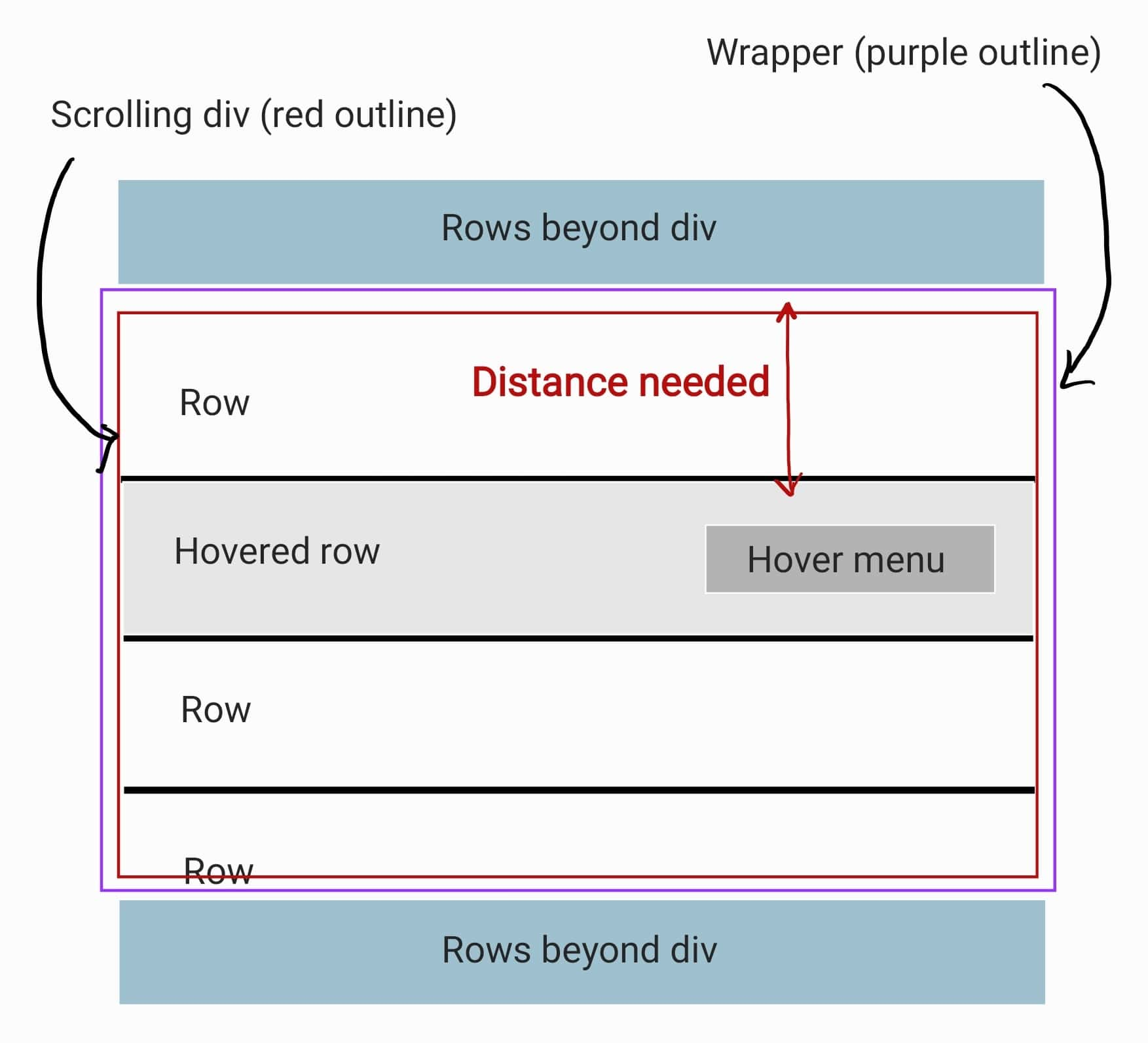
Calculating the x-coordinate
To determine the x-coordinate, we make the following calculation:
x = hoveredRowRect.left - wrapperRect.left
In our component, you can't scroll along the x-axis. Because of the 1px border on the wrapper element, the hoveredRowRect.left value will be 1px greater than the wrapperRect.left value, so this will return 1. Here's a visual example of what we're calculating.
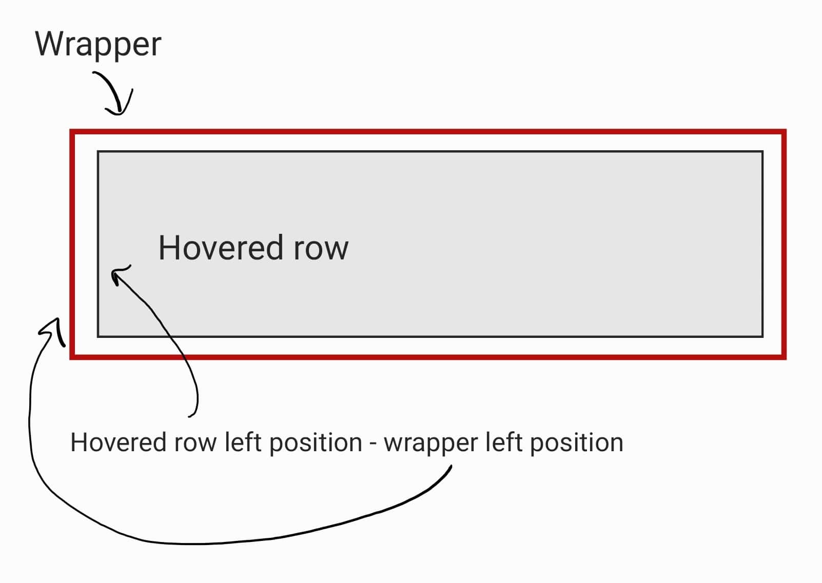
It should be noted that in our component, we set the right position to the x-coordinate and don't set the left position at all. This is so that the hover menu appears in the empty space to the right of the row text, but you could apply the same calculation to the left instead. We're basically telling the hover menu to be positioned 1px (plus padding) from the right edge of the wrapper element.
Calculating the y-coordinate
To determine the y-coordinate, we make the following calculation:
y = hoveredRowRect.top - wrapperRect.top
This calculation is more interesting because we can scroll along the y-axis. The top value of the hoveredRow element will always be greater than or equal to the top value of the wrapper element. This is because we start scrolling at the top value of the wrapper element and can only scroll to positions greater than its top value.
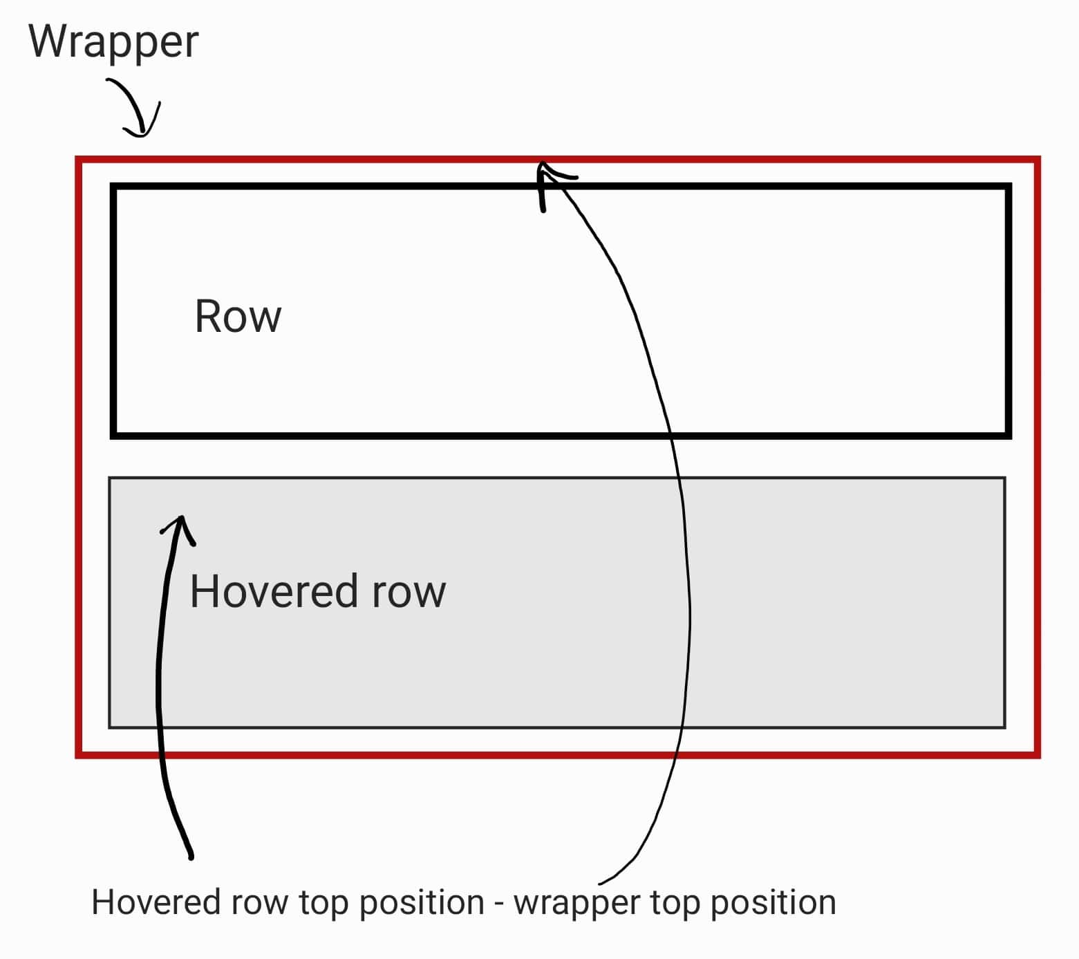
If we were to just use the hoveredRowRect.top value for the y-coordinate, then the hover menu would appear further down the page than the hovered row because we'd be setting it to the hovered row's top position relative to to the wrapper element's top position. This means that we'd essentially be making this calculation, hoveredRowRect.top + wrapperRect.top, which would generate a y-coordinate greater than the hovered row's top value. Here's an example of setting the y-coordinate to just the hoveredRowRect.top value; try scrolling and hovering over the rows to see the poor hover menu positioning.
Hiding the Hover Menu
We probably don't want the hover menu to remain permanently visible after we hover over a row. It would be better to hide the menu again when either the wrapper element and its children are no longer hovered, the row loses hover, or we begin scrolling.
To do this, we'll add the following:
- An
onMouseLeaveevent on the hovered row that calls an event handler to selectively hide the menu - An
onMouseLeaveevent from thewrapperelement that callssetShowMenu(false) - An
onScrollevent from thescrollingDivelement that callssetShowMenu(false)to prevent awkward interim menu positioning while you scroll
1import React, { useState, useRef } from "react";
2
3export const ScrollingDivWithHoverMenu = ({ data }) => {
4 const wrapperElement = useRef(null);
5 const [showMenu, setShowMenu] = useState(false);
6
7 // Initially set the menu position to the top left corner of
8 // the wrapper element
9 const [menuPosition, setMenuPosition] = useState({ x: 0, y: 0 });
10
11 const updateMenuPosition = (event) => {
12 // We can't get the position of the wrapper until it's rendered
13 // and without it, we can't position the menu
14 if (!wrapperElement.current) {
15 return;
16 }
17
18 const { current: wrapper } = wrapperElement;
19 const hoveredRowRect = event.target.getBoundingClientRect();
20 const wrapperRect = wrapper.getBoundingClientRect();
21
22 // Optional based on how you want to position the menu relative to the row
23 const padding = 20;
24
25 setMenuPosition({
26 x: hoveredRowRect.left - wrapperRect.left + padding,
27 y: hoveredRowRect.top - wrapperRect.top + padding
28 });
29 setShowMenu(true);
30 };
31
32 const hideMenu = () => {
33 // Shouldn't hide the menu if you're hovering over it
34 if (showMenu) {
35 return;
36 }
37
38 setShowMenu(false);
39 };
40
41 return (
42 <div
43 className="wrapper"
44 ref={wrapperElement}
45 onMouseLeave={() => setShowMenu(false)}
46 >
47 <div
48 className="scrollingDiv"
49 onScroll={() => setShowMenu(false)}
50 >
51 <ul>
52 {data.map((item) => {
53 return (
54 <li
55 className="item"
56 key={item.id}
57 onMouseOver={(event) => updateMenuPosition(event)}
58 onMouseLeave={() => hideMenu()}
59 >
60 {item.title}
61 </li>
62 );
63 })}
64 </ul>
65 </div>
66
67 <div
68 className="hoverMenu"
69 style={{
70 display: showMenu ? "block" : "none",
71 top: menuPosition.y,
72 right: menuPosition.x
73 }}
74 >
75 <button onClick={() => alert('Adding a description')}>✏️ Add a Description</button>
76 </div>
77 </div>
78 )
79}
Within the hideMenu event handler, we only call the setShowMenu function if showMenu isn't currently true. This keeps the menu open when you move from hovering over the row to hovering over the menu. Without that check, the menu flickers when you try to hover over the menu.
We now have a hover menu that appears and positions itself on top of the row being hovered.
Complete Example
Here's a CodeSandbox with all of the code for the finished component.